Basics of UI Design for Front-End Developers
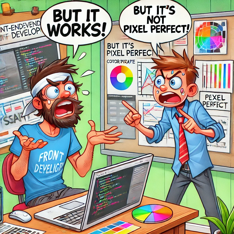 DALL-E tried 😢 — created when image generation was not very good
Let's start with WHY?
As a front-end developer, understanding UI design is crucial. While writing good code and managing stakeholders are important, creating clean and intuitive UI/UX is equally vital. Unfortunately, many developers overlook this, leading to frustration among designers when even the "most obvious" things are missed. But how do we know what is missed without knowing we're missing it?!
While it's true that not everything a designer requests can be accomplished within a given timeframe, paying attention to smaller details leaves room for more meaningful discussions on important aspects.
In fast paced environments, the design might not always be available, therefore some essentials should be known when working with a free hand.
Additionally this helps in communicating better practices with designers, encourages sharing good ideas, and ensures a smoother workflow — especially when working with young designers who may not have all the answers. Collaboration leads to the best products.
Also, at some point, you would be presenting an idea to leaders — you can't have a poorly designed POC (Proof of Concept) or presentations. A good-looking presentation is the key to getting approvals because, like it or not, looks matter a bit!
This article will just cover the surface, you should check out full courses to learn more if it interests you.
Inspired by Joe Natoli's Udemy course Design Rules: Principles + Practices for Great UI Design, here are some essential principles and tips for front-end developers:
Basics to keep in mind:
- Nothing in UI design is arbitrary. Every element serves a purpose beyond just looking cool. Always ask: "Why is this here?"
- Simplicity should never compromise usability. For instance, don't add icons just to save space, assuming users will intuitively understand them.
- Look for reducing the cognitive load on the user's mind.
- Jacob's Law — The law states that users prefer your site to work the same way as all the other sites they are already familiar with.
- Form (design) follows function (purpose), but also a lot more. While functionality is critical, design is also influenced by (but not limited to) the following:
- Audience needs
- Client desires
- Ethics and aesthetics
- Technological constraints
- Cultural nuances (e.g., icon meanings)
- Hardware limitations
- Budget and resources
- User mood
- How receptive the designer is to feedback xD
Like development, design is affected by many factors. Involve all stakeholders (designers, front-end, back-end, product managers etc) in decision-making, to reach the best possible outcome.
Easy Tips for Better UI Design
They are not rules engraved in stone, but it will give you a better understanding as to how you need to think while developing UI.
TL;DR: make it easy for the user to view and navigate!
1. Design for "fat fingers"
Ensure mobile tap targets are at least 48px in diameter. If users miss their target, they'll assume the app doesn't work.
2. Make technology do more, users do less
Reduce typing and manual input wherever possible. Use autocomplete, personalised data, and remove unnecessary fields to streamline user interaction.
3. Balance and Harmony (working together as a whole)
- No area should overpower another unless intentionally designed to stand out.
- Avoid too many focal points. A cluttered interface overwhelms users.
- Maintain consistent padding, colours, margins, and fonts. Consistency reduces cognitive effort.
- Use proximity to group related elements, which aids comprehension.
4. Alignment
Proper alignment makes designs more usable and understandable.
Adding on to the 'Balance and Harmony' point-1, some elements can intentionally be misaligned to stand out.
When in doubt, align everything, and give some margin/padding for breathability.
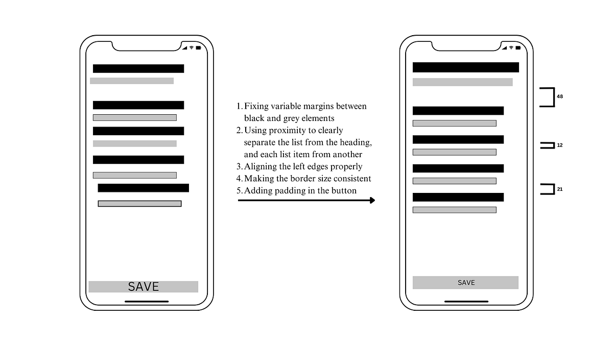 Example for tip 3 & 4 — small changes can make the design look way better if not perfect!
5. Colour and Contrast
- Use colour to communicate and guide interaction, not just for aesthetics. For instance, blue for links is universally recognised.
- Avoid overusing saturated colours, as they can fatigue users (see example below). Saturated colours attract the most user attention. Too much of it in a large area overstimulates the retinas which can strain the eyes.
- Ensure colour isn't the sole differentiator to maintain accessibility for colourblind users. As you can see in the image below, a lot of colours look the same in greyscale!
- Contrast enhances readability, draws attention, and directs focus. With low contrast, eye cant focus. They keeps bouncing as there is no dominance in the UI.
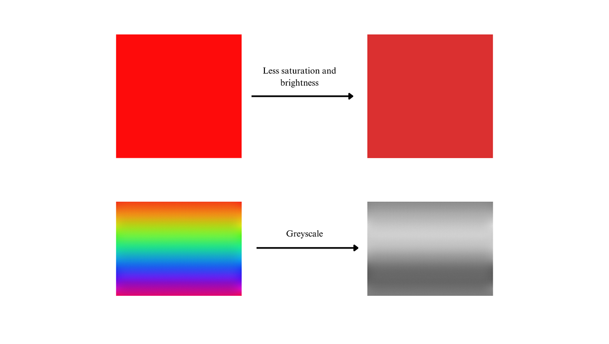 Example for tip 5
6. Typography
- Key terms to know: kerning (spacing between letters) and leading (line spacing).
- Left-aligned text is faster to read than centre-aligned because it provides a consistent starting point.
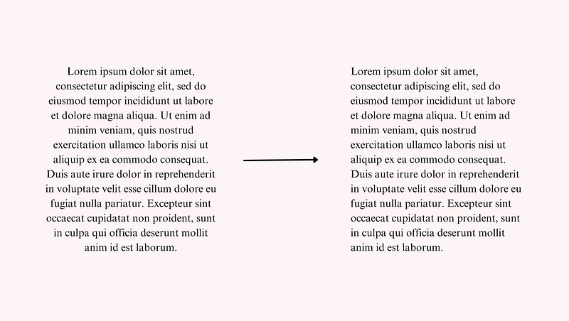 Example for tip 6
7. Imagery
Do not reduce a human subject to an object, no cheap shot; it reduces value of the product or service. Even if you attract more people, you will attract the wrong audience. Avoid objectifying people in images. Empower them instead.
Check out Material Design's imagery guidelines. It has a great set of tips and instructions that can't be covered in a few lines.
8. Visual Weight
Icons with the same pixel size may not have the same visual weight. Adjust to ensure uniform focus and balance. This is applicable to a lot more things apart from icons, trust your eyes!
Even though the left-side shapes have same widths, the circle looks overpowering. The right-side shapes seem more visually balanced.
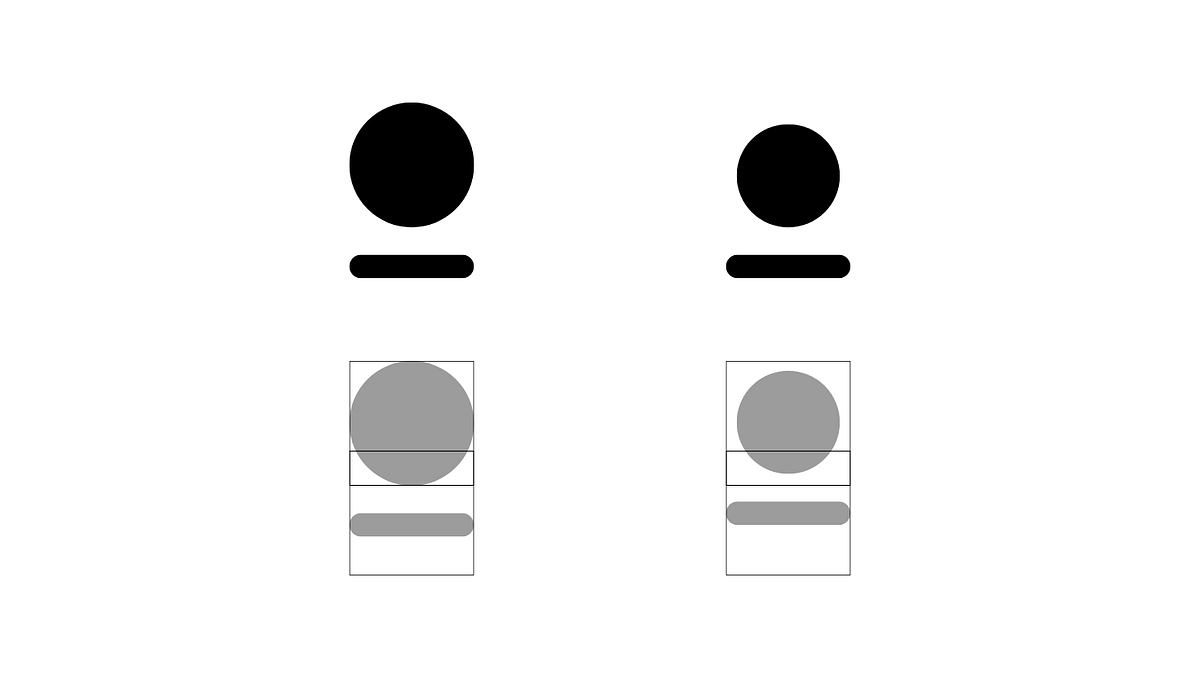 Example for tip 8
Found a brilliant blog on the same, which explains the illusions caused by visual weight difference in detail.
Conclusion
Understanding UI design is not just a designer's responsibility. As a front-end developer, your input is crucial to bridging the gap between functionality and aesthetics. By following these ideas, you'll build better products, foster healthier collaborations, and improve the user experience.
Remember, design is not just about making things look good; it's about making things work well — beautifully.
Here is another great blog I found covering concepts like spacing and alignment in more detail.
Feel free to share your thoughts or add to the list if I've missed something important. Let's build great products!